Physical Address
304 North Cardinal St.
Dorchester Center, MA 02124
Physical Address
304 North Cardinal St.
Dorchester Center, MA 02124


This is the most exciting part of EDA. We’ve learned each feature individually in Part 3. Now we ask the real question: who survived, and why?
Sherlock has examined every clue individually. Now he starts connecting them.
The mud on the shoes came from the east garden, which only the gardener used between 9 and 11 AM, and the victim was last seen at 10:30…
Each piece connects. That is what bivariate analysis. Connecting features to each other and to the outcome. We stop looking at columns in isolation and start asking: what do two columns tell us together?
Let us look at the actual numbers right out of the dataset:
| Group | Survival rate |
|---|---|
| Female passengers | 74% |
| Male passengers | 19% |
| 1st class passengers | 63% |
| 2nd class passengers | 47% |
| 3rd class passengers | 24% |
No complicated model needed. Just pandas and a couple lines of code, and clear patterns jump out.
import seaborn as sns
import matplotlib.pyplot as plt

fig, axes = plt.subplots(1, 3, figsize=(15, 5))

# Sex vs Survival
survival_by_sex = df.groupby('Sex')['Survived'].mean()
bars = axes[0].bar(survival_by_sex.index, survival_by_sex.values,
                   color=['#1D9E75', '#E24B4A'])
axes[0].set_title('Survival rate by Sex')
axes[0].set_ylabel('Survival rate')
# Add percentage labels on bars
for bar, val in zip(bars, survival_by_sex.values):
    axes[0].text(bar.get_x() + bar.get_width()/2, val + 0.01,
                 f'{val:.1%}', ha='center', fontweight='bold')

# Pclass vs Survival
survival_by_class = df.groupby('Pclass')['Survived'].mean()
bars2 = axes[1].bar(['1st', '2nd', '3rd'],
                    survival_by_class.values,
                    color=['#1D9E75', '#EF9F27', '#E24B4A'])
axes[1].set_title('Survival rate by Passenger Class')
for bar, val in zip(bars2, survival_by_class.values):
    axes[1].text(bar.get_x() + bar.get_width()/2, val + 0.01,
                 f'{val:.1%}', ha='center', fontweight='bold')

# Age distribution: survived vs died
df[df['Survived']==1]['Age'].hist(bins=25, ax=axes[2], alpha=0.6,
                                   label='Survived', color='#1D9E75')
df[df['Survived']==0]['Age'].hist(bins=25, ax=axes[2], alpha=0.6,
                                   label='Died', color='#E24B4A')
axes[2].set_title('Age: survived vs died')
axes[2].set_xlabel('Age (years)')
axes[2].legend()

plt.tight_layout()
plt.show()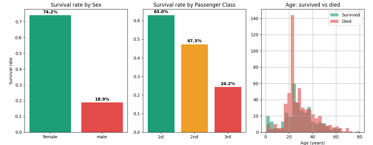
Key insight: Being female gave you a 74% chance of surviving. Being male: only 19%. Being in 1st class gave you 63% survival vs 24% in 3rd class. Sex and Pclass will be the two most important features in any Titanic model.
Bar charts show averages. But Violin plots show the full shape of the distribution per group.
fig, axes = plt.subplots(1, 2, figsize=(10, 4))

# Fare distribution by survival
sns.violinplot(
    data=df,
    x='Survived',
    y='Fare',
    hue='Survived',
    ax=axes[0],
    palette=['#E24B4A', '#1D9E75'],
    legend=False
)
axes[0].set_title('Fare distribution: survived vs died')
axes[0].set_xticks([0, 1])
axes[0].set_xticklabels(['Died', 'Survived'])

# Age distribution by survival
sns.violinplot(
    data=df,
    x='Survived',
    y='Age',
    hue='Survived',
    ax=axes[1],
    palette=['#E24B4A', '#1D9E75'],
    legend=False
)
axes[1].set_title('Age distribution: survived vs died')
axes[1].set_xticks([0, 1])
axes[1].set_xticklabels(['Died', 'Survived'])

plt.tight_layout()
plt.show()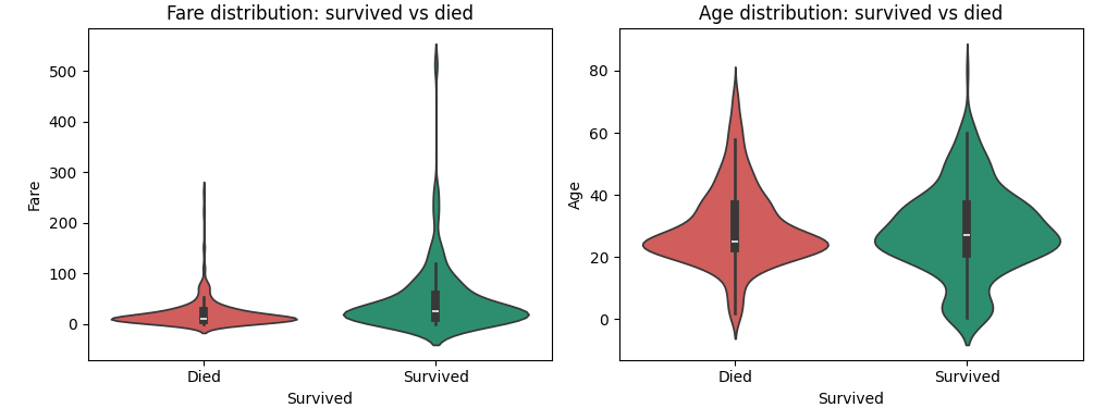
What the Fare violin tells us ?
Survivors paid significantly higher fares on average. The violin for “Survived” is thicker at higher fare values — passengers who paid more had access to better cabin locations, closer to lifeboats. This is Fare acting as a proxy for wealth and location on the ship.
What the Age violin tells us ?
The shapes look quite similar! Both groups have a similar age distribution. This is why Age showed only -0.07 correlation with Survived earlier. But look carefully — the survived group has a slightly fatter section in the 0-10 range. Kids did get priority. You can literally see the women and children first effect right in the data.
# Encode Sex as numeric for correlation analysis
df['Sex_encoded'] = (df['Sex'] == 'female').astype(int)

corr_cols = ['Survived', 'Pclass', 'Sex_encoded', 'Age',
             'SibSp', 'Parch', 'Fare', 'Has_Cabin']
corr_matrix = df[corr_cols].corr()

plt.figure(figsize=(9, 7))
mask = np.zeros_like(corr_matrix, dtype=bool)
mask[np.triu_indices_from(mask)] = True

sns.heatmap(corr_matrix,
            annot=True,
            fmt='.2f',
            cmap='RdYlGn',
            center=0,
            square=True,
            linewidths=0.5,
            mask=mask)
plt.title('Feature correlation matrix — Titanic')
plt.tight_layout()
plt.show()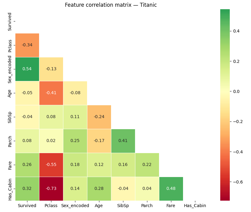
Check out these results (correlation with Survived):
| Feature | Correlation | What it means |
|---|---|---|
| Sex_encoded | +0.54 | Strong predictor—females lived |
| Has_Cabin | +0.32 | Having a cabin (= 1st/2nd class) predicts survival |
| Fare | +0.26 | More money, better outcome |
| Pclass | -0.34 | Higher class number (lower class) predicts death |
| Age | -0.05 | Almost no linear relationship with survival |
| SibSp | -0.04 | Negligible |
Remember, this is Pearson correlation. If something is nonlinear—like kids having extra odds—it won’t show up here. That is why you always want to pair this kind of analysis with a closer group look with heatmap.
Want the biggest insight with almost no code? Try a crosstab:
# Survival rate by Sex AND Pclass combined
pivot = pd.crosstab(
    index=df['Pclass'],
    columns=df['Sex'],
    values=df['Survived'],
    aggfunc='mean'
).round(2)

print(pivot)
Sex female male
Pclass
1 0.97 0.37 ← 97% of 1st class women survived!
2 0.92 0.16
3 0.50 0.14 ← only 14% of 3rd class men survivedThis tiny table tells a huge story:
For a binary target like Survived, there is a more precise way to check feature correlations:
from scipy import stats

numeric_features = ['Age', 'Fare', 'SibSp', 'Parch', 'Has_Cabin', 'Sex_encoded']

print("Point Biserial Correlation with Survived:\n")
for col in numeric_features:
    corr, pval = stats.pointbiserialr(df['Survived'], df[col])
    significance = "✓ significant" if pval < 0.05 else "✗ not significant"
    print(f"  {col:<16} r={corr:+.3f}   p={pval:.4f}   {significance}")
Result:
Point Biserial Correlation with Survived:

  Age              r=-0.047   p=0.1587   ✗ not significant
  Fare             r=+0.257   p=0.0000   ✓ significant
  SibSp            r=-0.035   p=0.2922   ✗ not significant
  Parch            r=+0.082   p=0.0148   ✓ significant
  Has_Cabin        r=+0.317   p=0.0000   ✓ significant
Sex_encoded r=+0.543 p=0.0000 ✓ significantHere is the short list, straight from EDA:
| Feature | Signal strength | Direction | Notes |
|---|---|---|---|
| Sex | Very strong | Female = survive | Most important feature |
| Pclass | Strong | 1st = survive | Proxy for wealth + cabin location |
| Fare | Moderate | Higher = survive | Correlated with Pclass — redundant but useful |
| Has_Cabin | Moderate | Has cabin = survive | We engineered this from the missing Cabin col |
| Age | Weak but real | Younger = slight advantage | Non-linear — children specifically helped |
| SibSp | Not significant | — | Drop or combine into Family_Size |
| Parch | Weak | — | Combine with SibSp |
In Part 5, we’ll mix all this together. Multivariate analysis—combining everything we have learned and building a true predictive model. See you there.


Nice one