Physical Address
304 North Cardinal St.
Dorchester Center, MA 02124
Physical Address
304 North Cardinal St.
Dorchester Center, MA 02124


In Part 2, we got the patient’s file open. Now, it is the time for the real examination. We’re going to look at each “organ”—each feature in our dataset — one by one.
This is called univariate analysis, which is just a fancy term for looking at one variable at a time. We are not trying to find relationships yet. We are just getting a feel for the landscape. What does the Age column actually look like? How were the ticket Fares distributed?
Think of yourself as a quality inspector at a fruit market. Before you make any buying decisions, you examine each fruit individually.
You are not comparing apples to oranges yet — you are checking each one independently.
For numeric columns, my first move is always a histogram. It is the fastest way to see the shape of the data. When I look at a histogram, I am basically asking:
Representing in Tabular way makes us easy to remember
| Pattern | What it means | What to do |
|---|---|---|
| Mean ≈ Median | Roughly symmetric — healthy | Nothing special needed |
| Mean >> Median | Right-skewed (long right tail) | Consider log transform |
| Mean << Median | Left-skewed | Consider square root transform |
| Two peaks (bimodal) | Two hidden subgroups in data | Investigate — might need to split |
| Outliers in box plot | Unusual extreme values | Investigate before imputing |
Age Distribution: Histogram
# Set graph layout
fig, axes = plt.subplots(1, 1, figsize=(6, 4))

# Age — histogram with mean and median lines
axes.hist(df['Age'].dropna(), bins=30, color='#378ADD', edgecolor='white', alpha=0.8)
axes.set_title('Age distribution')
axes.set_xlabel('Age (years)')
axes.set_ylabel('# of Passengers')
axes.axvline(df['Age'].mean(), color='red', linestyle='--', label=f'Mean: {df["Age"].mean():.1f}')
axes.axvline(df['Age'].median(), color='green', linestyle='--', label=f'Median: {df["Age"].median():.1f}')
axes.legend()

plt.tight_layout()
plt.show()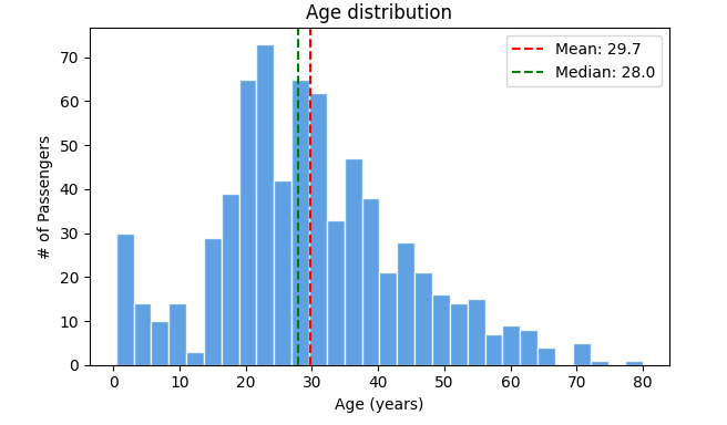
Age Outliers: Box plot
# Set graph layout
fig, axes = plt.subplots(1, 1, figsize=(6, 4))

# Age — box plot to spot outliers
axes.boxplot(df['Age'].dropna(), vert=False)
axes.set_title('Age — outlier check')
axes.set_xlabel('Age (years)')

plt.tight_layout()
plt.show()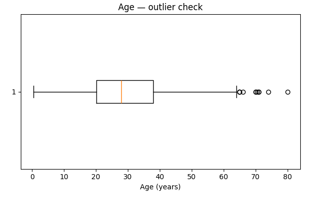
My take: The mean (29.7) and median (28.0) are super close. This tells me the Age distribution is roughly symmetric, which is great. We see a small peak for children, which makes sense. The box plot shows a few older passengers, but nothing looks like a data entry error. The youngest passenger was 0.42 years (an infant!) and the oldest was 80. For now, Age looks healthy.
Fare Distribution: Histogram
# Set graph layout
fig, axes = plt.subplots(1, 1, figsize=(6, 4))

# Fare — histogram (right-skewed!)
axes.hist(df['Fare'], bins=40, color='#D85A30', edgecolor='white', alpha=0.8)
axes.set_title('Fare distribution (right-skewed!)')
axes.set_xlabel('Ticket fare (£)')
axes.set_ylabel('# of Passengers')
axes.axvline(df['Fare'].mean(), color='red', linestyle='--', label=f'Mean: £{df["Fare"].mean():.1f}')
axes.axvline(df['Fare'].median(), color='green', linestyle='--', label=f'Median: £{df["Fare"].median():.1f}')
axes.legend()


plt.tight_layout()
plt.show()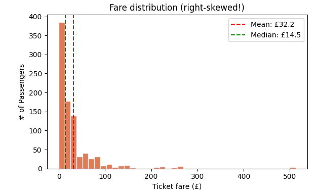
Fare distribution after log transform: Histogram
# Set graph layout
fig, axes = plt.subplots(1, 1, figsize=(6, 4))

# Fare after log transform — much better!
import numpy as np
axes.hist(np.log1p(df['Fare']), bins=40, color='#1D9E75', edgecolor='white', alpha=0.8)
axes.set_title('Fare after log transform — much better!')
axes.set_xlabel('log(Fare + 1)')
axes.set_ylabel('# of Passengers')

plt.tight_layout()
plt.show()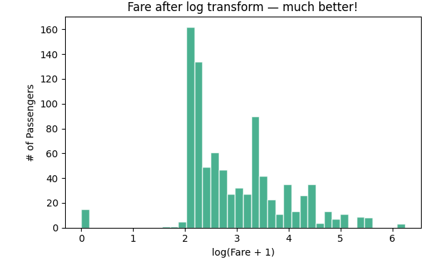
My take: Woah. Look at that first chart. The vast majority of people paid less than £50, but a tiny handful paid over £500. This massive right-skew pulls the mean (£32.20) to be more than double the median (£14.45).
This is a classic problem. Many machine learning models get confused by this kind of distribution. The fix? A log transform. By taking the logarithm of the fare (np.log1p is great because it handles zero-fares gracefully), we squish the high values closer to the rest of the data. Look at the second chart, it is much more symmetrical and “normal-looking.” We will have to use this transformed version when we build our model.
For categorical data, bar charts are your best friend. They quickly show you the balance (or imbalance) between groups.
fig, axes = plt.subplots(1, 3, figsize=(10, 3))

# Sex distribution
df['Sex'].value_counts().plot(kind='bar', ax=axes[0], color=['#378ADD', '#D85A30'])
axes[0].set_title('Passenger count by Sex')
axes[0].set_xticklabels(axes[0].get_xticklabels(), rotation=0)

# Pclass distribution
df['Pclass'].value_counts().sort_index().plot(kind='bar', ax=axes[1], color='#7F77DD')
axes[1].set_title('Passenger count by Class')
axes[1].set_xticklabels(['1st (Upper)', '2nd (Mid)', '3rd (Lower)'], rotation=0)

# Embarked distribution
df['Embarked'].value_counts().plot(kind='bar', ax=axes[2], color='#1D9E75')
axes[2].set_title('Embarked port distribution')
axes[2].set_xticklabels(axes[2].get_xticklabels(), rotation=0)

plt.tight_layout()
plt.show()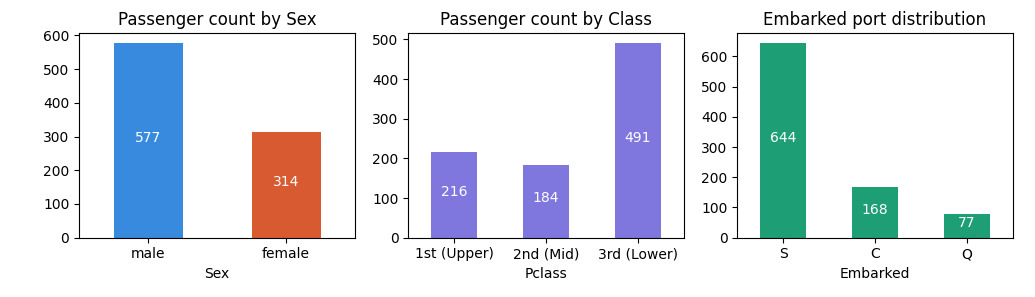
My take: No surprises, but some crucial context here.
Most beginners see null values and immediately fill them with mean or median. This is dangerous. There are 3 types of missing data, and only one of them is safe to impute naively.
Imagine a classroom register with absent students.
1 — MCAR (Missing Completely at Random):
Students randomly absent due to illness. No pattern. Safe to estimate their marks from the class average.
2 — MAR (Missing at Random):
Students from one school zone are absent because of local transport issues. The absence is related to another known factor (location). Be careful imputing — group by the related factor first.
3 — MNAR (Missing Not at Random):
The students who scored lowest are absent because they are embarrassed to come in. The very thing you want to measure (performance) is driving the absence. Imputing here introduces hidden bias.
# Check: is Age missing more in certain passenger classes?
print(df.groupby('Pclass')['Age'].apply(lambda x: x.isnull().mean()).round(3))
Pclass
1 0.139 # 13.9% of 1st class ages are missing
2 0.060 # 6% of 2nd class
3 0.277 # 27.7% of 3rd class ages are missing!Aha! The Age data is not missing randomly. It is missing far more often for 3rd class passengers. This is MAR. If we just used the overall median age, we would be giving 3rd class passengers an age that is likely biased by the older 1st and 2nd class passengers.
And what about Cabin? It is missing for 77% of people. This is because lower-class passengers didn’t have assigned cabins. The missingness is a feature of their status. This is MNAR.
The Titanic missing data breakdown in Tabular way
| Column | Null count | Type | Why |
|---|---|---|---|
| Embarked | 2 | MCAR | Two passengers, no pattern — pure randomness |
| Age | 177 | MAR | Missing more in 3rd class — class-based bias |
| Cabin | 687 | MNAR | 3rd class had no assigned cabins by design — the class itself drives missingness |
Based on our investigation, here is the right way to handle it:
# Fix 1: Embarked — only 2 nulls, MCAR, use mode (most common port)
df['Embarked'] = df['Embarked'].fillna(df['Embarked'].mode()[0])

# Fix 2: Age — MAR, fill with median grouped by passenger class
# (3rd class passengers were systematically different in age distribution)
df['Age'] = df.groupby('Pclass')['Age'].transform(
    lambda x: x.fillna(x.median())
)

# Fix 3: Cabin — MNAR, 77% missing, don't impute
# Instead, create a binary flag: did this passenger have a cabin assigned?
df['Has_Cabin'] = df['Cabin'].notna().astype(int)
df = df.drop('Cabin', axis=1)

# Verify — should be all zeros now
print("Nulls after fixing:\n", df.isnull().sum())
Nulls after fixing:
PassengerId 0
Survived 0
Pclass 0
Name 0
Sex 0
Age 0 # fixed
SibSp 0
Parch 0
Fare 0
Embarked 0 # fixed
Has_Cabin 0 # replaced Cabin with a binary flagNote: Why did we create
Has_Cabininstead of just dropping Cabin? Because having an assigned cabin is actually information — it indicates the passenger was likely in 1st or 2nd class. We keep that signal even though we can’t use the raw cabin values. EDA insight turned into a feature.
fig, axes = plt.subplots(1, 2, figsize=(12, 5))

# Fare outliers
df.boxplot(column='Fare', ax=axes[0])
axes[0].set_title('Fare — outlier check')

# Age outliers (post-imputation)
df.boxplot(column='Age', ax=axes[1])
axes[1].set_title('Age — outlier check')

plt.tight_layout()
plt.show()

print(f"Fare: Max = £{df['Fare'].max():.2f}, 99th percentile = £{df['Fare'].quantile(0.99):.2f}")
Fare: Max = £512.33, 99th percentile = £249.01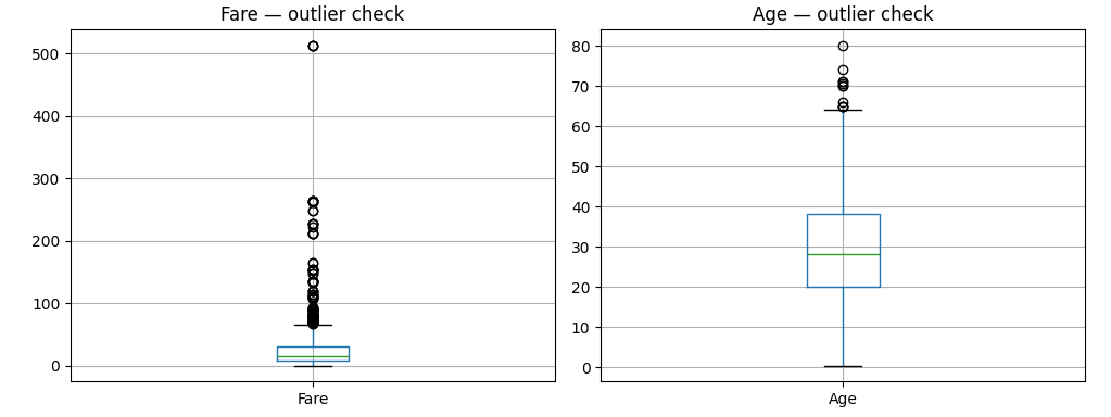
The box plot will show several large dots (outliers) on the Fare chart. That max of £512 is real — a passenger named Miss Charlotte Cardeza paid it for a luxury suite. We don’t remove this.
| Feature | Finding | Action |
|---|---|---|
| Age | ~normal, 177 nulls (MAR) | Impute by Pclass median ✓ |
| Fare | Right-skewed, max £512 | Log transform |
| Cabin | 77% null (MNAR) | Replace with Has_Cabin binary flag ✓ |
| Embarked | 2 nulls (MCAR) | Fill with mode (S) ✓ |
| Sex | 65% male | Will be strong predictor — Part 4 confirms this |
| Pclass | 55% in 3rd class | Class imbalance — will affect model |
In Part 4, the exciting part — bivariate analysis. We will find out exactly which features predicted survival on the Titanic, with real survival rates from the actual data.
Let us explore more in Part 4.